Usage Dashboard
Provides a detailed analysis of the active users benefiting from the channel and their recurrence and engagement
Welcome to the Quick Start Guide of the Usage Dashboard!

Usage Dashboard
click to enlarge
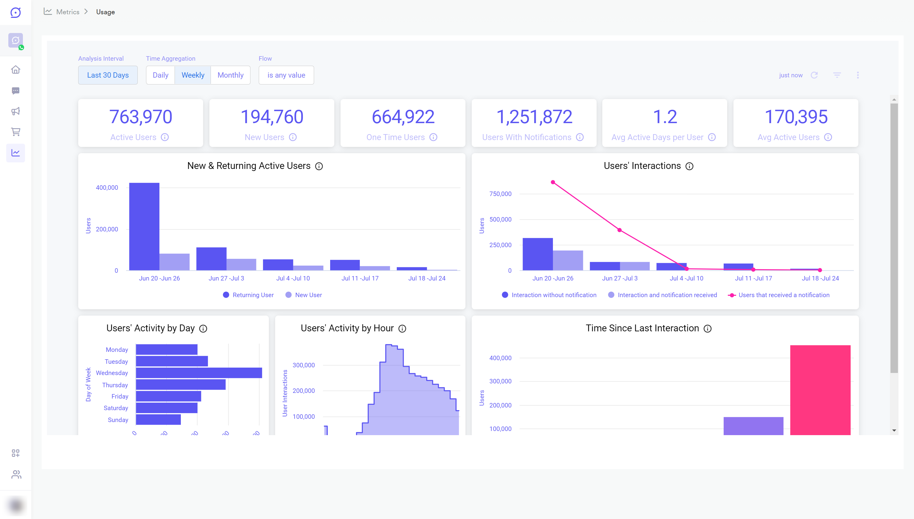
The Usage Dashboard allows you to see in a general approach how the Flow performs in terms of its usage.
Providing meaningful analytics that can help measure the active users benefiting from the channel and their recurrence and engagement.
In this Quick Start guide, we'll show you how to learn, explore, and act about the Usage Dashboard of your channel. You'll see the play-by-plays you need to get the Dashboards basics under your belt, making you a seasoned expert in no time.
Learn
Obtain information about user interactions and their activity.
Explore
Filter by date, time aggregation, or Flow ID based on your needs.
Act
Analyze the information and decide to redefine your Flow on what's essential for your goals and focus them on the right path.
Before You Start
Prerequisites
Before you start this tutorial, make sure that:
- You have a Yalo Studio account.
- Time has passed since your Flow is active and data is available to analyze.
Build confidence by trying things on your own!
Go to the Analytics section (left on the main navigation panel), then click Usage , and then play around the dashboard!
Get familiar with the Usage dashboard
The page is made of the following content::
- Data Boxes
- Graphics of Data about Active Users and their activity
Let's start with the Data Boxes.
First Data Boxes
The first three Data Boxes are these:

Usage Dashboard - 1st set of Data Boxes highlighted
click the image to enlarge
Dashboard filters
Analysis Interval: Change the date ranges to see the information. By default, it is the last thirty days.
Time Aggregation: This allows you to select an aggregation level for the dashboard. This affects Data Boxes with a time axis.
Consider that selecting a different time frame might be necessary to show the expected amount of plot points when the time aggregation is modified.
Flow: This filter selects a specific Flow for the analysis, in case you have more than one.
Once you change a filter, click the reload button on the right side.
The next three Data Boxes

Usage Dashboard - 2nd set of Data Boxes highlighted
click the image to enlarge
Active user: User who has received or sent a message.
Yalo Tip
Download the data for deeper research, see the section Export Data at the bottom of this guide.
Usage Graphics
The page contains several graphics; the first two are:

Usage Dashboard - 1st Two Graphics
click the image to enlarge

Usage Dashboard - Last Graphics
click the image to enlarge
Export Data
You can download data from each Data Box from the Usage Dashboard in several formats, such as CSV, Excel, JSON, HTML, and Markdown, among others.
To export the data:
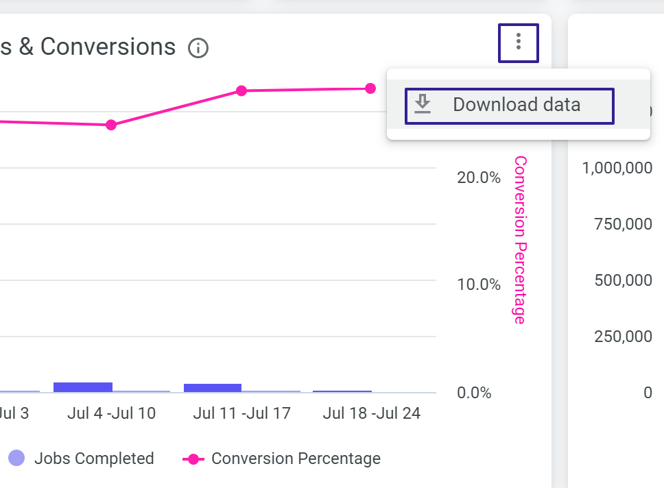
- Click on the three-dot menu at the top right of the Data Box/Graphic.
- Then click on the Download data button.

Three-dot menu and Download data pop-up selected in a Dashboard Graphic
click the image to enlarge
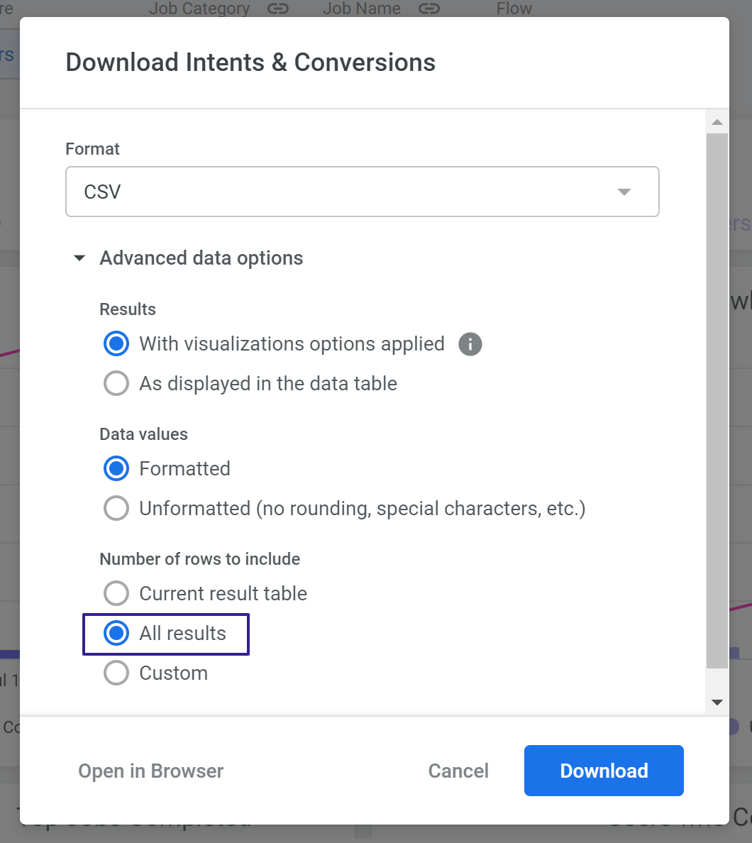
- In the pop-up, choose the type of format you want.
- Click on Advanced data options

Exporting Data pop-up with "All results" option selected
click the image to enlarge
We recommend leaving the rest of the checks marked as they are, only changing the field: Number of rows with the value: All Results, so that the export of data gets correctly generated.
- Click Download
- Save the file for further analysis.
If "All Results" is not available
Downloading an unlimited number of results is restricted for queries with table calculations.
To download more than "Results in Table", select "Custom" and enter a limit of up to 100,000 rows.
Updated about 2 years ago
