Commerce Storefront Dashboard
Uncovers valuable insights into our e-commerce solution related to revenue, user behavior, product engagement, and session/cart behavior
Welcome to the Quick Start Guide of the Commerce Storefront Dashboard!
Yalo Studio - Commerce Storefront Dashboard
click the image to enlarge
Commerce Storefront Dashboard is designed to display analytics related to revenue generated by sent orders and the number of users with interaction inside Storefront, along with Users' Behavior and Products.
In this Quick Start Guide, we'll show you how to learn, explore, and act about the Commerce Storefront Dashboard of your channel. You'll see the play-by-plays you need to get the Dashboards basics under your belt, making you an expert in no time.
Learn
Obtain information about revenue growth or pitfalls and understand how users interact with Storefront, among other valuable data.
Explore
Filter by date, time aggregation, or User Category, based on your needs.
Act
Analyze the information, and define your users' behavior to focus on what products you can promote with notifications or campaigns to increase revenue or quantity.
Before You Start
Prerequisites
Before you start this tutorial, make sure that:
- You have a Yalo Studio account.
- Time has passed since your Flow is active, so data is available to analyze.
Build confidence by trying things on your own!
Go to the Analytics section (left on the main navigation panel), then click Commerce , and then play around the dashboard!
Overview Tab
The page is made of three tabs:
- Overview
- Users' Behavior
- Products & Categories
- Stores' Behavior
- Session's Behavior
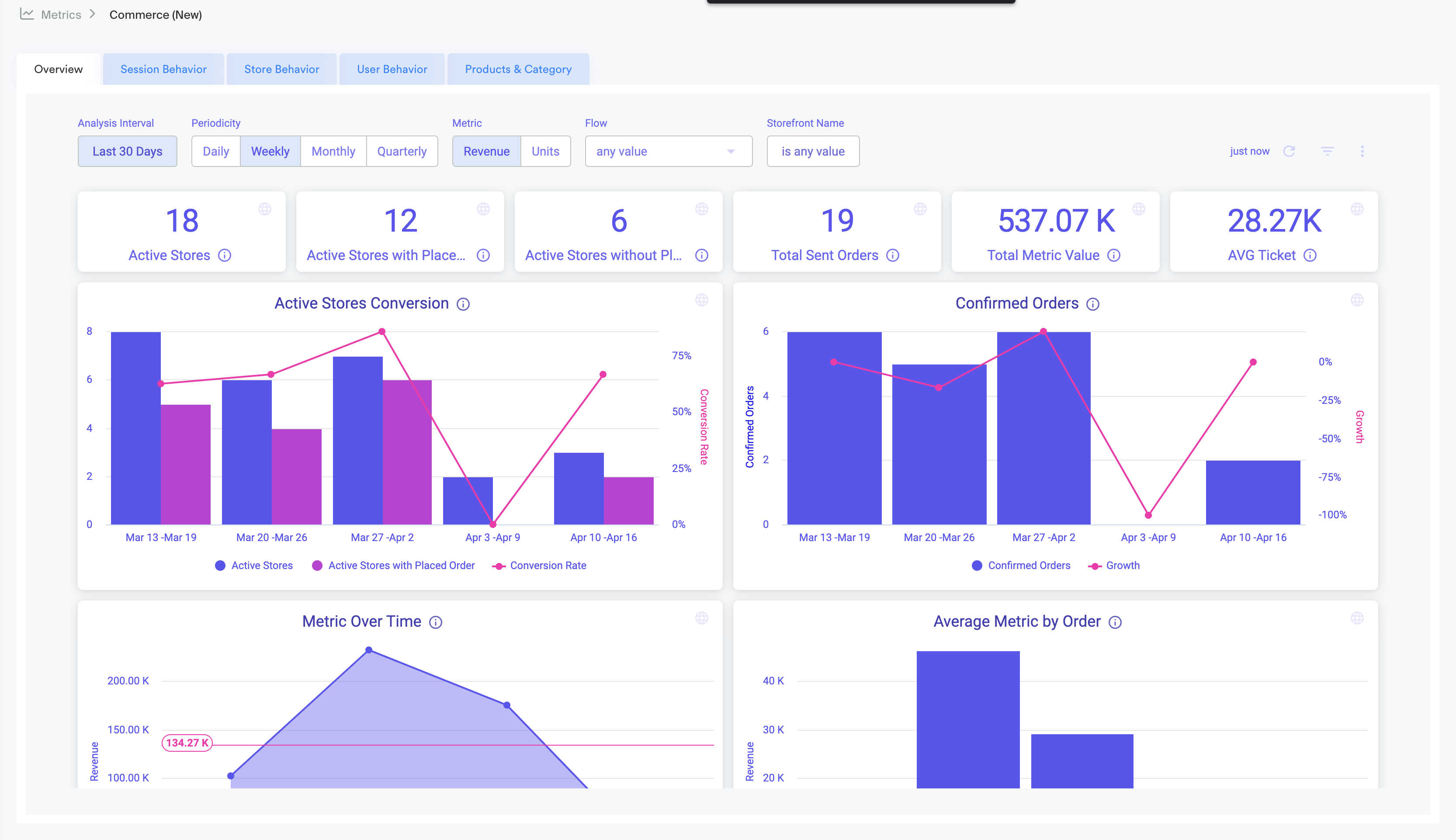
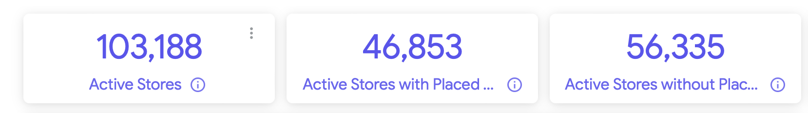
Let's start with the Overview tab; the page contains three main rows.
Data Boxes
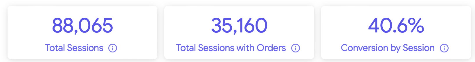
The first three Data Boxes are these:
Commerce Storefront Dashboard main section, 1st set of Data Boxes highlighted
click the image to enlarge
Dashboard filters
Analysis Interval: Change the date ranges to see the information. The default value is Last 30 days.
Time Aggregation: This allows you to select an aggregation level for the dashboard. Meaning, at what level of detail do you want to see the information, changing the graphics.
Metric Value: You can select the category of the user in which data will be displayed. You can select the measure which will be analyzed and displayed. Can be Unit or Revenue.
Attribute Group: You can select the group of attributes corresponding to the store, such as, country, address, vendor, delivery date, among others.
Attribute : You can select the value attribute corresponding to the store, for example: Country - MEX.
Once you change a filter, click the reload button on the right side.
Yalo Tip
Download the data for deeper research, see the section Export Data at the bottom of this guide.
The next three Data Boxes
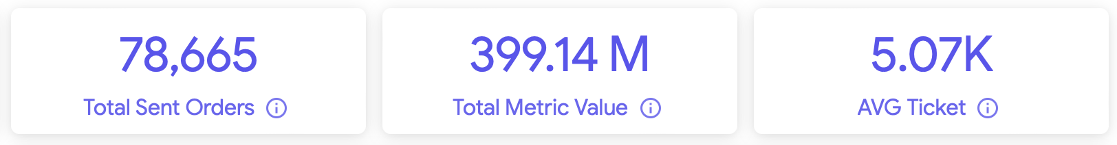
Commerce Storefront Dashboard main section, 2nd set of Data Boxes highlighted
click the image to enlarge
Yalo Tip
Download the data for deeper research, see the section Export Data at the bottom of this guide.
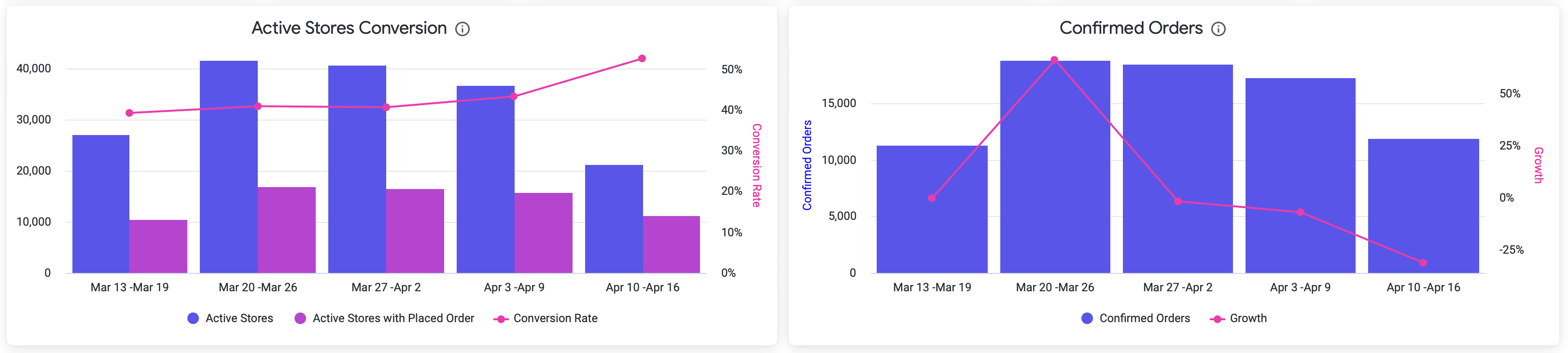
Graphics
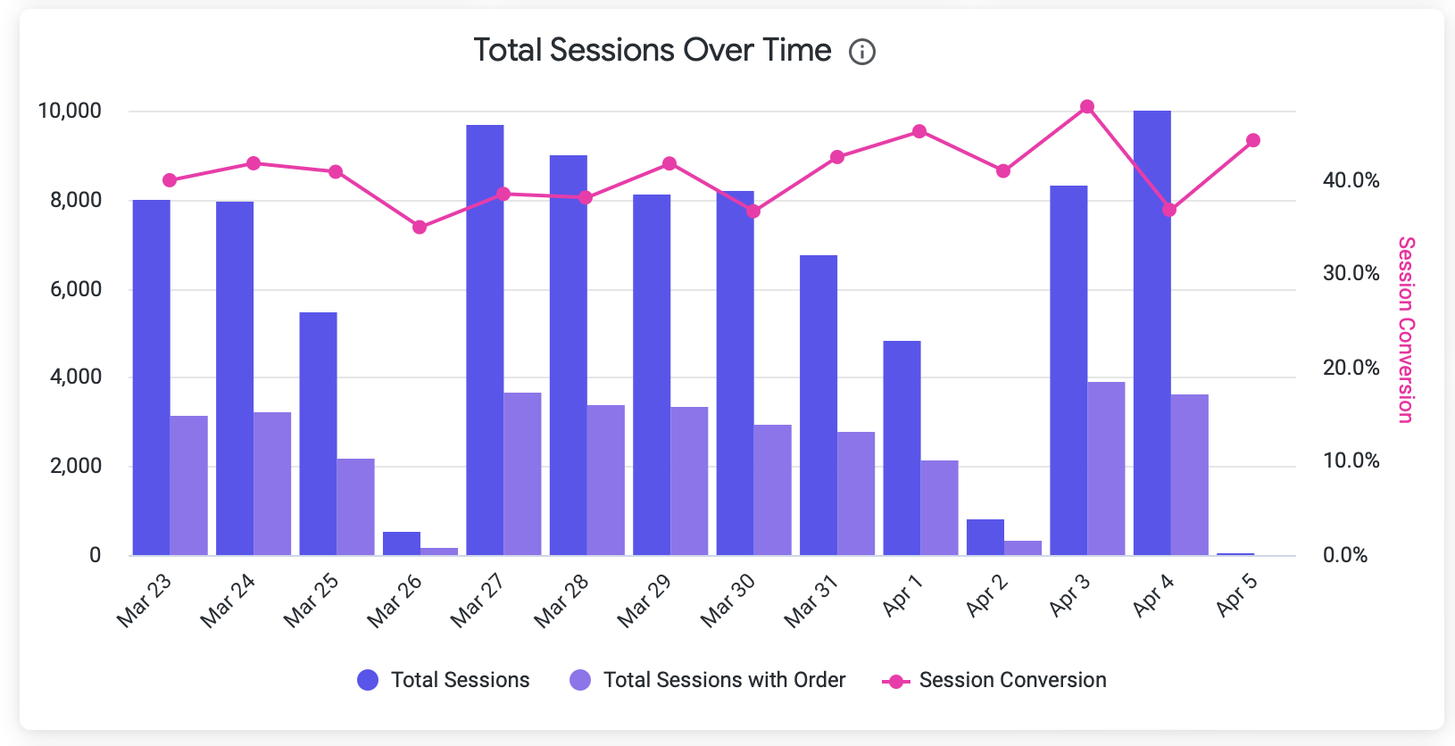
The tab contains several attractive graphics; the first two are:
Commerce Storefront Dashboard - Overview Tab - 1st Graphics
click the image to enlarge
Active Users: The number of users with at least one Storefront event.
Users With Sent Order: The number of users with at least one sent order.
Conversion Rate: The quantity of users with sent orders is divided by the number of active users.
Yalo Tip
Hover over the bars to see the detailed information in each graphic; also, click on the elements (Active User, Users With Sent Order, etc.) to enable/disable the filters for further analysis.
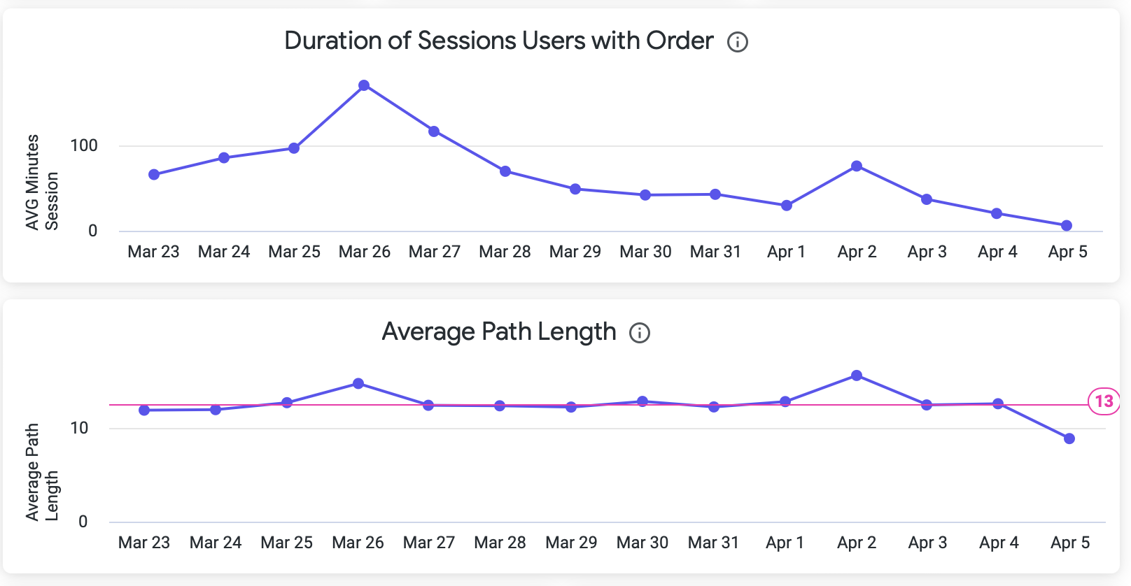
More Graphics With Interesting Data
Commerce Storefront Dashboard - Overview Tab - More Graphics
click the image to enlarge
Yalo Tip
Hover over the graphics bars to see the detailed information.
Users' Behaviour Tab
In the Users' Behaviour Tab, you can deeply understand how users interact with Storefront.
Data Boxes
The page contains three main rows; the first set of Data Boxes are:

Commerce Storefront Dashboard - Users' Behavior Tab - 1st set of Data Boxes
click the image to enlarge
Dashboard filters in Users' Behaviour Tab
Analysis Interval: Change the date ranges to see the information. The default value is Last 30 days.
Time Aggregation: This allows you to select an aggregation level for the dashboard. Meaning, at what level of detail do you want to see the information, changing the graphics.
User Category: You can select the category of the user in which data will be displayed.
Attribute Group: You can select the group of attributes corresponding to the store, such as, country, address, vendor, delivery date, among others.
Attribute : You can select the value attribute corresponding to the store, for example: Country - MEX.
Once you change a filter, click the reload button on the right side.
2nd set of Data Boxes

Commerce Storefront Dashboard - Users' Behavior Tab - 2nd set of Data Boxes
click the image to enlarge
Graphics
The Users' Behavior tab contains several attractive graphics; the first two are:

Commerce Storefront Dashboard - Users' Behavior Tab - 1st set of Graphics
click the image to enlarge
Yalo Tip
Download the data for more profound research; see the section Export Data at the bottom of this guide.
More Graphics With Interesting Data

Commerce Storefront Dashboard - Users' Behavior Tab - 2nd set of Graphics
click the image to enlarge
Product & Category Tab
The Product & Category dashboard lets you quickly understand product and category preferences, identifying those with high or low performance. It aims to give you insights into what products you can promote with notifications or campaigns to increase revenue or quantity of sold products.
Data Boxes
The page contains three main rows; the first set of Data Boxes are:

Commerce Storefront Dashboard - Product & Category Tab - 1st set of Data Boxes
click the image to enlarge
Dashboard filters in Product & Category Tab
Analysis Interval: Change the date ranges to see the information. The default value is Last 30 days.
Time Aggregation: This allows you to select an aggregation level for the dashboard. Meaning, at what level of detail do you want to see the information, changing the graphics.
Measure Value: You can select the category of the user in which data will be displayed. You can select the measure which will be analyzed and displayed. Can be Quantity or Revenue.
Attribute Group: You can select the group of attributes corresponding to the store, such as, country, address, vendor, delivery date, among others.
Attribute : You can select the value attribute corresponding to the store, for example: Country - MEX.
Product: You can select the product name or sku and see all visualizations regarding the selected product.
Once you change a filter, click the reload button on the right side.
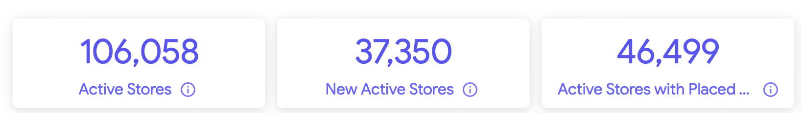
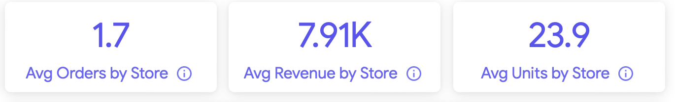
The next three Data Boxes

Commerce Storefront Dashboard - Product & Category Tab - 2nd set of Data Boxes
click the image to enlarge
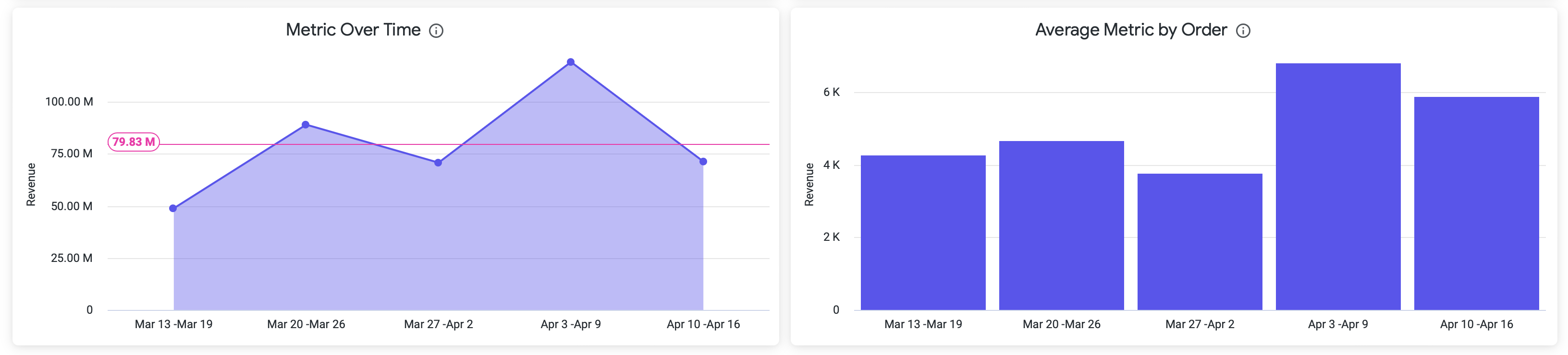
Product & Category Graphics
The Product & Category tab contains several attractive graphics; the first two are:

Commerce Storefront Dashboard - Product & Category Tab - 1st Graphics
click the image to enlarge
The following graphics contains more details.
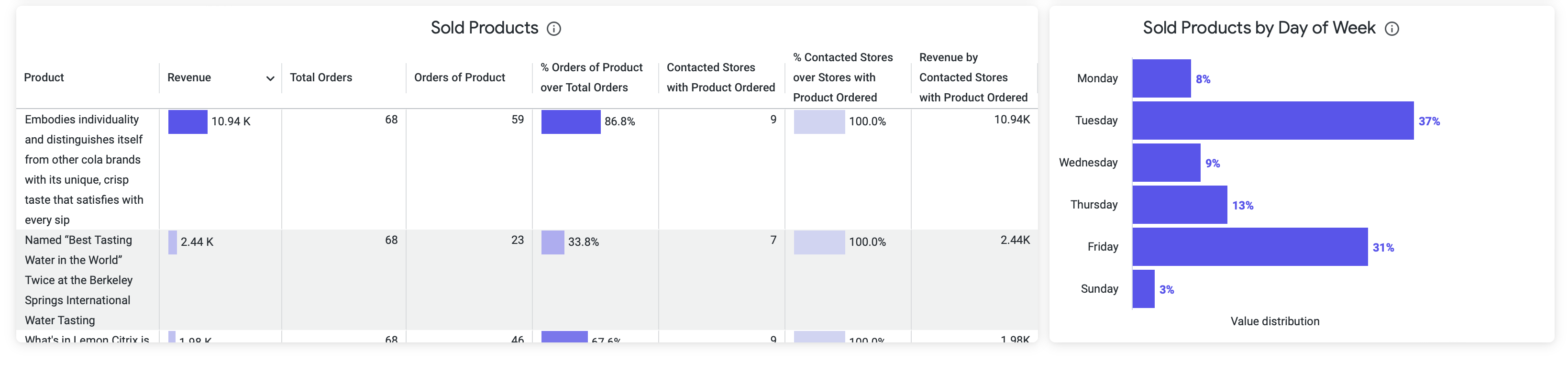
Commerce Storefront Dashboard - Product & Category Tab - Last set of Graphics
click the image to enlarge
Yalo Tip
Download the data for deeper research, see the section Export Data below.
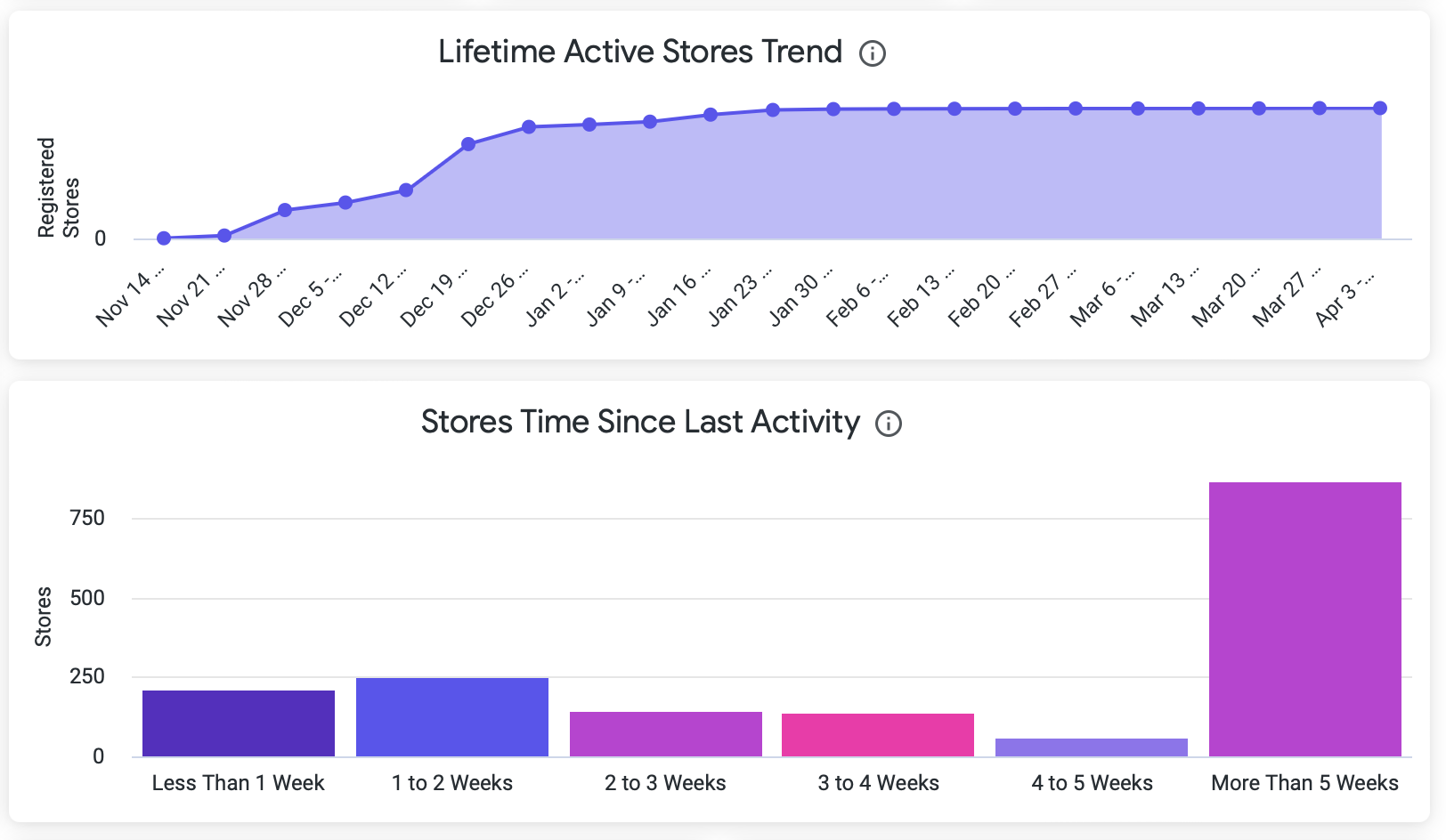
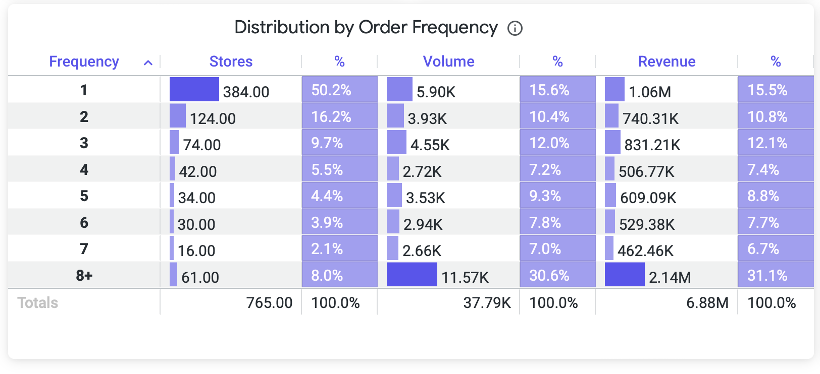
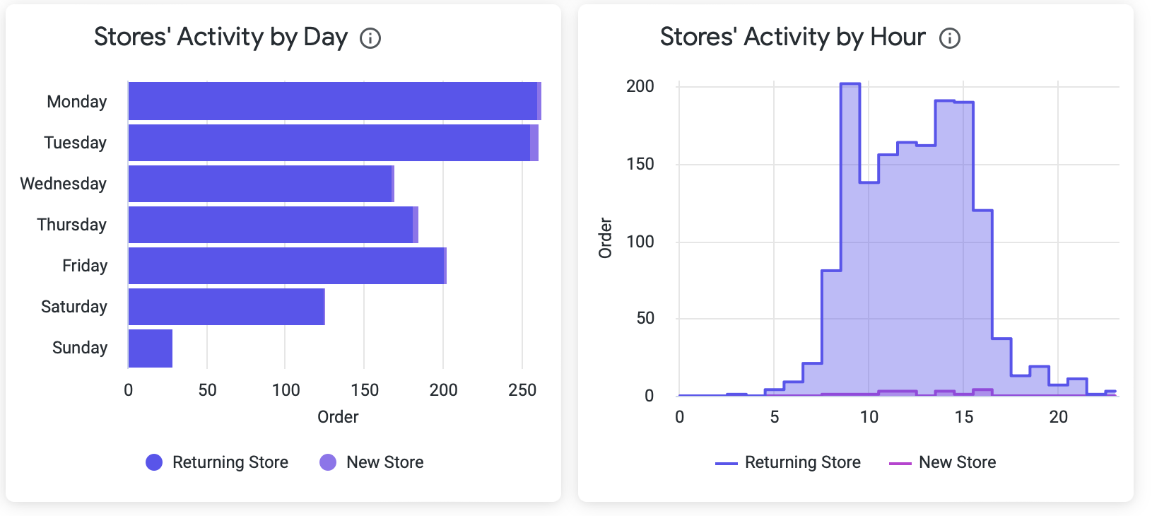
Stores Behavior Tab
The Store Behavior dashboard lets you quickly understand the commerce performance of stores, identifying those with high or low performance. It aims to give you insights into what stores have orders in what stores don't so you can promote with notifications or campaigns.
Data Boxes
The page contains three main rows; the first set of Data Boxes are:
Commerce Storefront Dashboard - Stores Behavior Tab - 1st set of Data Boxes
click the image to enlarge
The next three Data Boxes
Commerce Storefront Dashboard - Stores Behavior Tab - 2nd set of Data Boxes
click the image to enlarge
Store Behavior Graphics
The Store Behavior tab contains several attractive graphics; the first two are:
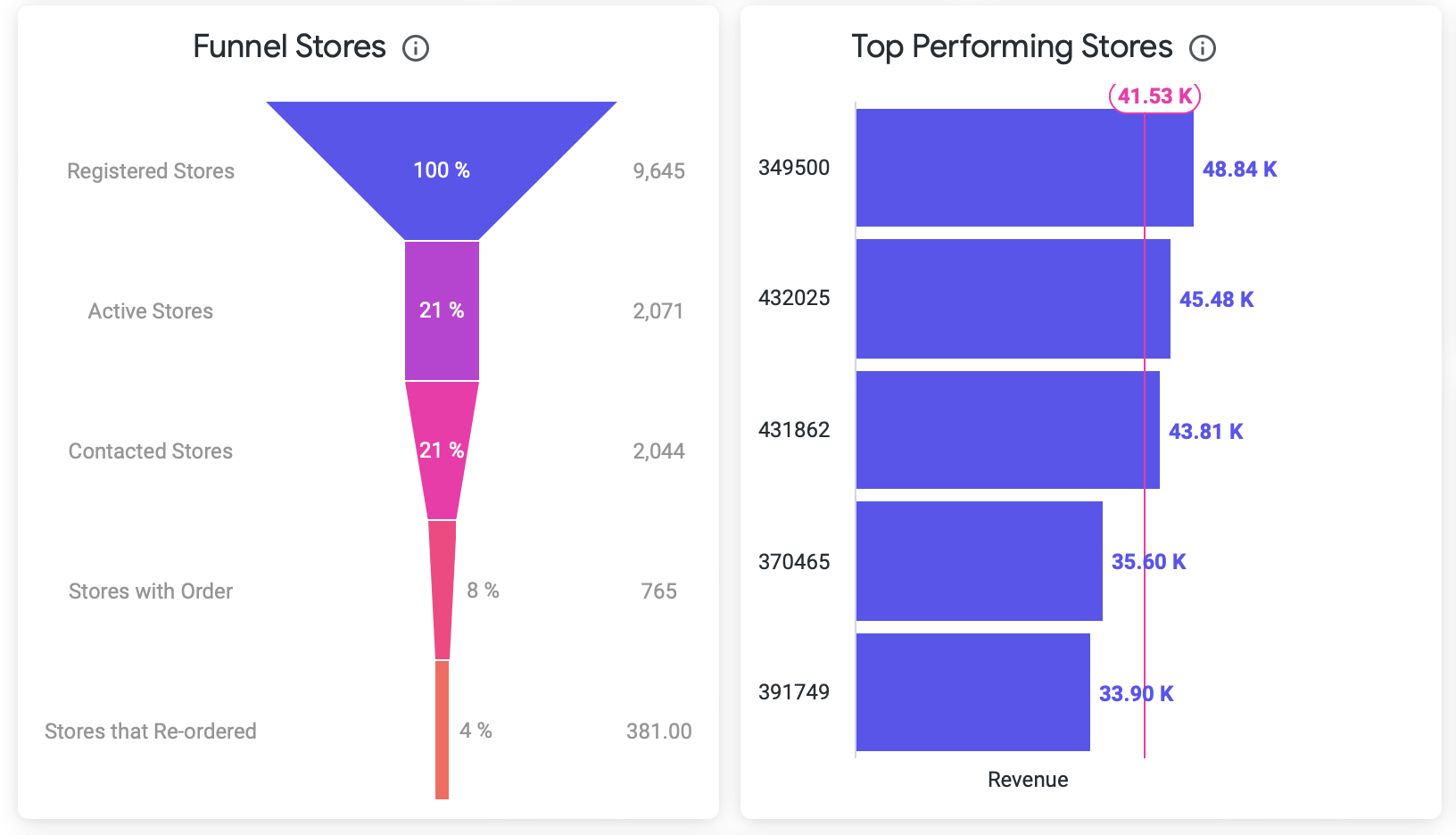
The following graphics contains more details.
Yalo Tip
Download the data for deeper research, see the section Export Data below.
Dashboard filters in Store Behavior Tab
Analysis Interval: Change the date ranges to see the information. The default value is Last 30 days.
Time Aggregation: This allows you to select an aggregation level for the dashboard. Meaning, at what level of detail do you want to see the information, changing the graphics.
Metric Value: You can select the category of the user in which data will be displayed. You can select the measure which will be analyzed and displayed. Can be Unit or Revenue.
User Category: You can select the category of the user in which data will be displayed.
Activity Value: You can select the activity type of the store in the flow. Can be Session or Order.
Attribute Group: You can select the group of attributes corresponding to the store, such as, country, address, vendor, delivery date, among others.
Attribute : You can select the value attribute corresponding to the store, for example: Country - MEX.
Once you change a filter, click the reload button on the right side.
Session Behavior Tab
The Session Behavior dashboard lets you quickly understand the commerce performance sessions when the store identifies correctly as a verified store and user in the flow. It aims to give you insights into what time major activity is on the flow and the relation in sessions and orders.
Data Boxes
The page contains three main rows; the first set of Data Boxes are:
Commerce Storefront Dashboard - Session Behavior Tab - 1st set of Data Boxes
click the image to enlarge
The next three Data Boxes

Commerce Storefront Dashboard - Session Behavior Tab - 2nd set of Data Boxes
click the image to enlarge
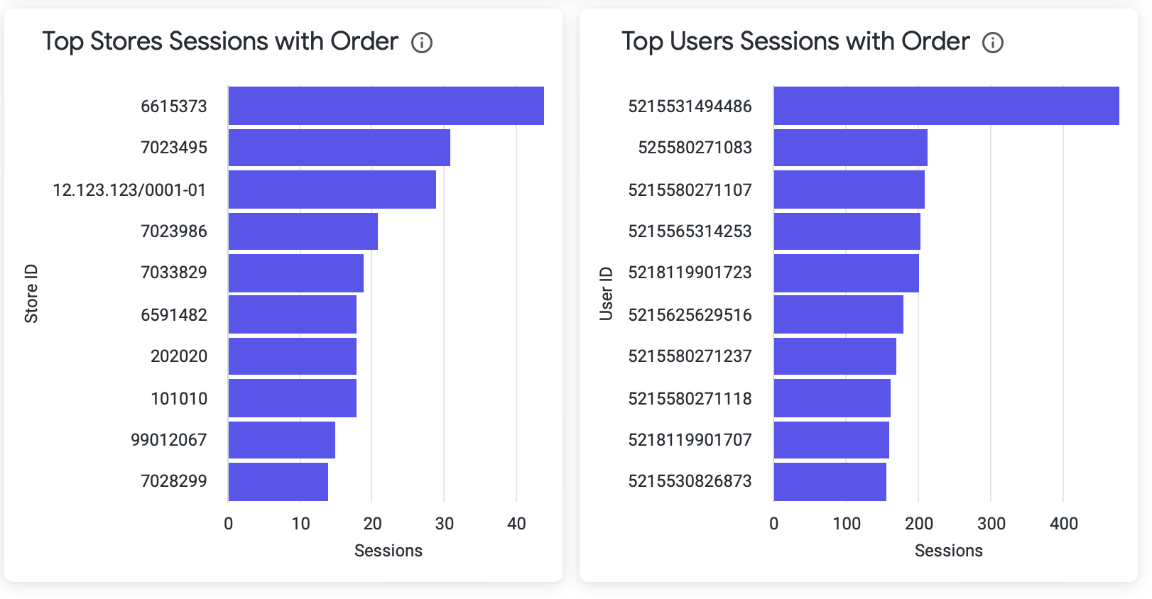
Session Behavior Graphics
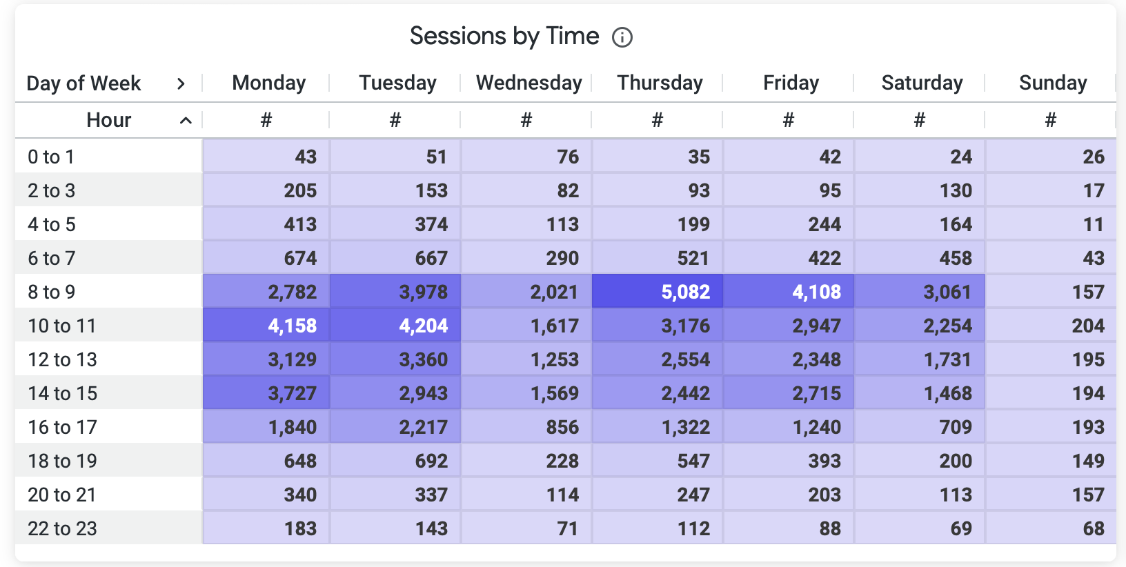
The Session behavior tab contains several attractive graphics; the first is:
The following graphics contains more details.
Yalo Tip
Download the data for deeper research, see the section Export Data below.
Dashboard filters in Session Behavior Tab
Analysis Interval: Change the date ranges to see the information. The default value is Last 30 days.
Time Aggregation: This allows you to select an aggregation level for the dashboard. Meaning, at what level of detail do you want to see the information, changing the graphics.
Attribute Group: You can select the group of attributes corresponding to the store, such as, country, address, vendor, delivery date, among others.
Attribute : You can select the value attribute corresponding to the store, for example: Country - MEX.
Once you change a filter, click the reload button on the right side.
Cart Behavior Tab
With Cart Behavior Dashboard, you can understand the number of carts created, those that turned into orders, and those that were abandoned, as well as their behavior over time and on each day. Another relevant metric is the conversion of prefilled_carts per product in the cart.
Data Boxes
The page contains three main rows; the first set of Data Boxes are:
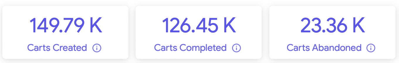
Cart Behavior Dashboard main section, 1st set of Data Boxes highlighted
click the image to enlarge
Dashboard filters in Cart Behavior Tab
Analysis Interval: Change the date ranges to see the information. The default value is Last 30 days.
Time Aggregation: This allows you to select an aggregation level for the dashboard. Meaning, at what level of detail do you want to see the information, changing the graphics.
Attribute Group: You can select the group of attributes corresponding to the store, such as, country, address, vendor, delivery date, among others.
Attribute : You can select the value attribute corresponding to the store, for example: Country - MEX.
Metric Value: You can select the category of the user in which data will be displayed. You can select the measure which will be analyzed and displayed. Can be Unit or Revenue.
Product: You can select the product name or sku and see all visualizations regarding the selected product.
Recommendation Type: You can select the different ML recommendations that will be applied to the analysis, those could be: FREQUENTLY_BOUGHT_TOGETHER, SUGGESTED_ITEMS or PREFILL_CART.
Notification Type: You can select the notification template that will be applied to the analysis.
Once you change a filter, click the reload button on the right side.
The next three Data Boxes
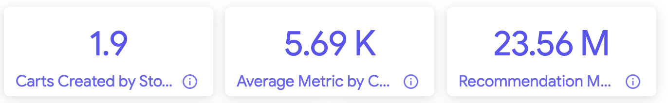
Cart Behavior Dashboard main section, 2nd set of Data Boxes highlighted
click the image to enlarge
Graphics
The tab contains several attractive graphics; the first two are:
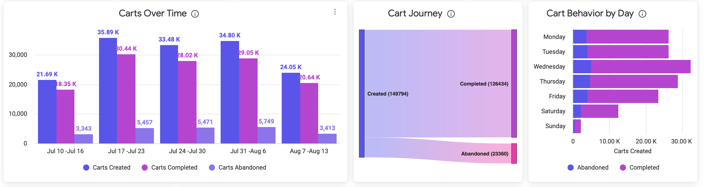
Commerce Storefront Dashboard - Cart Behavior Tab - 1st Graphics
click the image to enlarge
More Graphics With Interesting Data
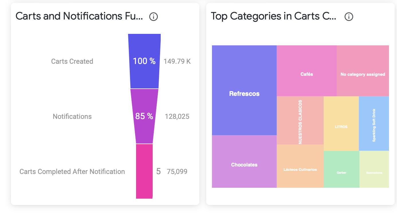
Commerce Storefront Dashboard - Cart Behavior Tab - 2nd Graphics
click the image to enlarge
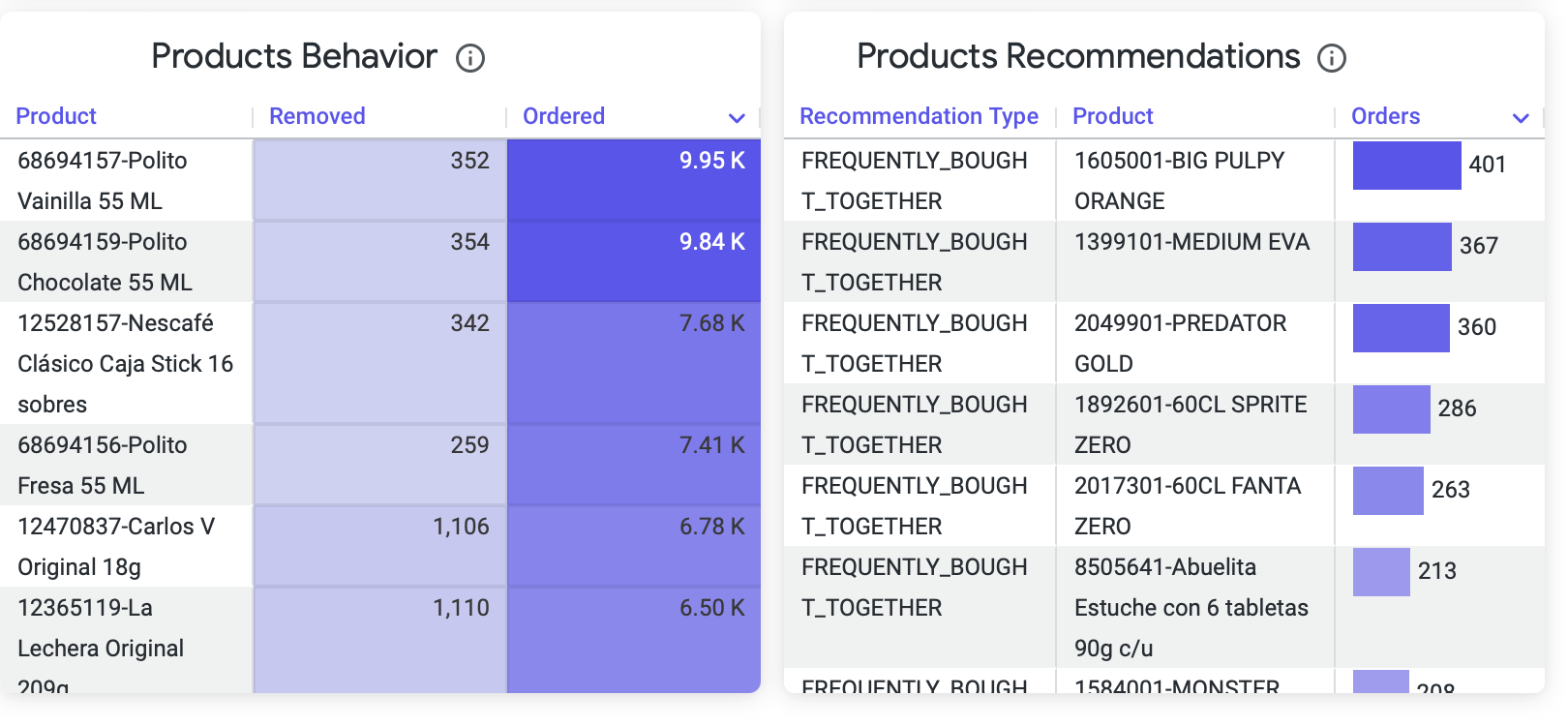
Commerce Storefront Dashboard - Cart Behavior Tab - 3rd Graphics
click the image to enlarge
Export Data
You can download data from each Data Box within the Campaigns Success Dashboard, in several formats, such as CSV, Excel, JSON, HTML, and Markdown, among others.
To export the data:
- Click on the three-dot menu at the top right of the Data Box/Graphic.
- Then click on the Download data button.

Three-dot menu and Download data pop-up selected in a Dashboard Graphic
click the image to enlarge
- In the pop-up, choose the type of format you want.
- Click on Advanced data options

Exporting Data pop-up with "All results" option selected
click the image to enlarge
We recommend leaving the rest of the checks marked as they are, only changing the field: Number of rows with the value: All Results, so that the export of data gets correctly generated.
- Click Download
- Save the file for further analysis.
If "All Results" is not available
Downloading an unlimited number of results is restricted for queries with table calculations.
To download more than "Results in Table", select "Custom" and enter a limit of up to 100,000 rows.
Updated over 1 year ago