Customer Satisfaction
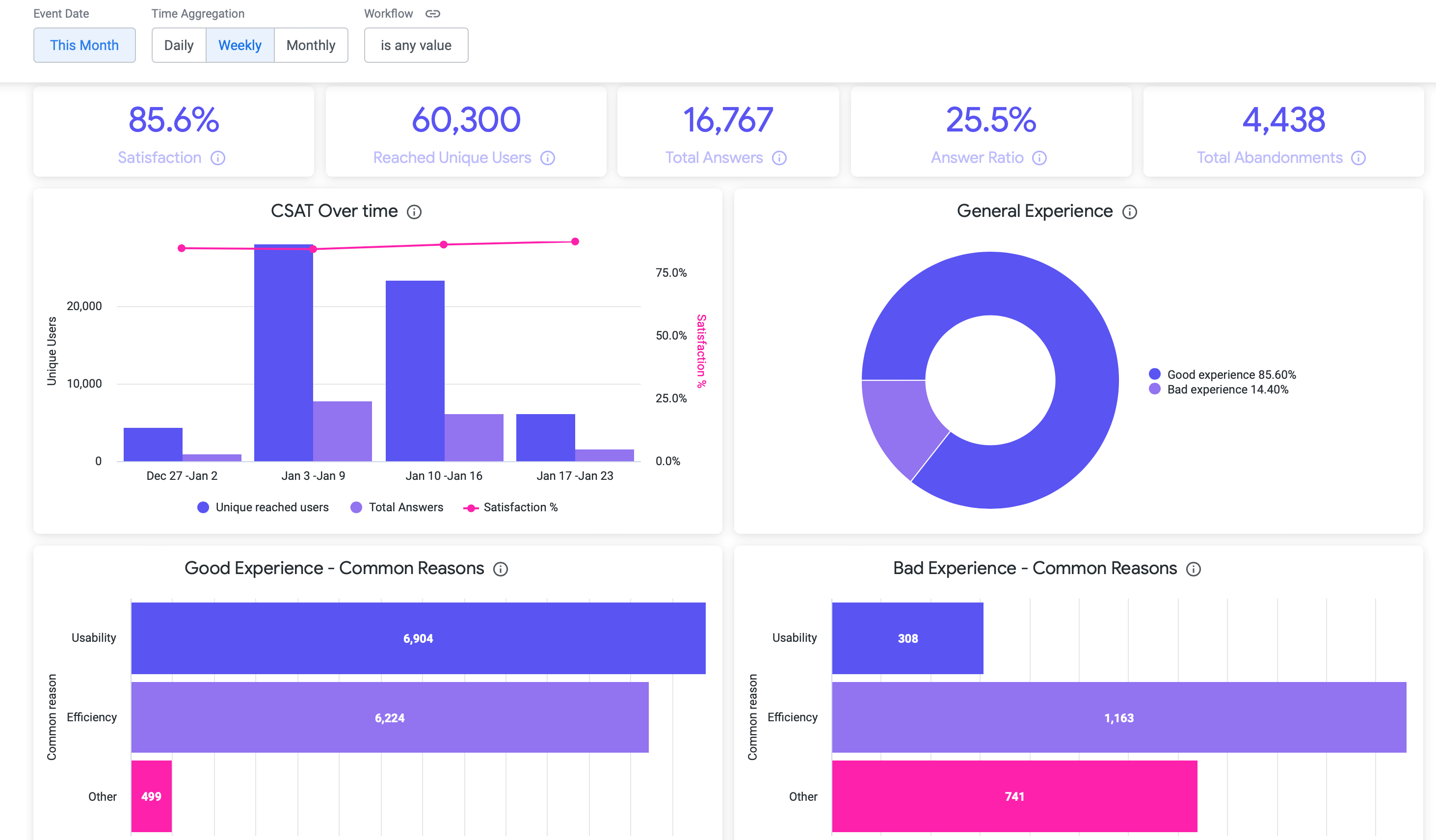
The Customer Satisfaction dashboard allows you to interpret the results of CSAT (Customer satisfaction) new dashboard to measure channel satisfaction and how many clients answered.

Customer Satisfaction Dashboard
Here's the description of the individual metrics inside the Customer Satisfaction dashboard:
| Satisfaction | This card shows the satisfaction ratio, this is the percentage of users who said that had a good experience using the channel. |
| Reached unique users | This card shows the amount of unique users who landed to CSAT experience in the first step. |
| Total answers | This card shows the total amount of answers in the activity that replied how was their experience using the channel. One user can have one or many answers and will be taken in account. |
| Answer Ratio | This card shows the answer ratio, the percentage of responses with good or bad feedback based on all times the CSAT was reached. |
| Users that abandoned | This card shows the amount of users who chose to leave, following the path in the workflow. |
| CSAT Over Time | Shows the amount of unique users who reached CSAT experience, the amount of total answers and the satisfaction ratio, is displayed according to the selected time frame by time aggregation period. This visualizations allows to analyze by time period the three metrics at the same time, provides us a wide perspective of the customer satisfaction of the channel for the selected client, as well if customers are really answering. |
| General Experience | Shows the percentage of users that answered that had a good experience compared to those who had a bad experience, can analyzed by percentage, as well by amount of users. |
| Good Experience - Common Reasons | Shows the amount of good experience answers classified by usability, efficiency and others. |
| Good Experience - Other Feedback | This visualization contains the feedback comments of the users who chose to have a bad experience and other reasons why they are dissatisfied. |
Updated over 2 years ago
